...Or maybe Timing.
Which one? I think that depends on what you're animating - they type of character, the situation, and the style. For this article I'm just going to focus on posing, and hopefully I can talk about timing more in the future.
Okay, I know that "posing" is not one of The 12 Principles of Animation as handed down on stone tablets by St. Frankenollie, but it's really darn important. It's actually kind of an uber-principle, as it combines elements of other principles within it, such as staging, appeal, exaggeration, and solid drawing. Again, it's a foolish pursuit to try to pick the most important animation principle, and you might rightly offer this counterpoint: posing without timing is just a comic book. Touché! But consider this: still images can suggest motion. And a good animator could animate an entire acting scene within a single clear pose. Live actors hold poses all the time. A good pose can communicate your character's physiology, personality, emotion and intent, even when the scene is paused. Animation is storytelling, and a good pose can tell a story.
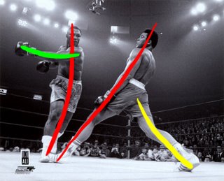
The thing that really got me wanting to talk about posing is this photo:

I saw this at an art auction (onboard the Disney Magic, of all places) and it damn near knocked the wind out of me. I had to stop and stare at it for a while to figure out if it was real. I had seen lots of photos of Muhammad Ali, but never this one. Incidentally, I've never been a fan of boxing, nor had I considered it much of a sport until I saw this documentary about Ali. Simply amazing. You must see it.
Anyway, back to the topic. This photo is rad for so many reasons, and it's one of those images that gets me excited about animation all over again. The lines of action are so clear, so extreme in this photo, that it almost feels staged or manipulated. You can feel Ali's lean back onto his right leg, and your brain wants to see the invisible arc of that left hook coming around. Look at the way the other boxer's body leans into Ali with a simple curve, while Ali's main line of action is a strong, straight line. The convergence of these two lines at the boxers' feet creates visual tension, and Ali's supporting right leg makes his silhouette huge and grounded. Check out this article from Carlos Baena for more about lines.
 I was so excited about this photo that I had to Google some more. I found this:
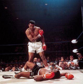 Boom! Another stunning image. There's a slightly more famous version of this photo in which Ali has his right arm at his side, but I like this one better. This image tells a clear story. The composition is so strong, it feels like it could have been a Michelangelo painting. Granted, I'm talking about posing, not staging, but the two are very intertwined, as I mentioned above. Check out all these triangles:
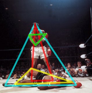
That's some amazing graphical composition! I love how all the triangles are pointed up like pyramids, except for the right arm, which points down at Liston as if to say, "don't even think about getting up!" You can't help but be impressed by Ali's dominance of Sonny Liston, and the posing and composition are reinforcing that story in every way.
Okay, one more Ali picture, just 'cause he's the man:
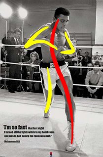
To me, this one is all about rhythm. Visual rhythm, that is. The way that line of action snakes up from his left foot all the way up to his head, the way the right leg echoes and supports that line, and the way the two arms complement the line, drawing your eye to their sharp angles, without ruining the flow of the pose. You can feel the twist of his hips, the lunge forward, the looseness of the wrists. There is a sense of lead and follow, of weight and momentum. You can imagine what came before, and what will come after. Your brain wants to see the action - it's begging for another pose, or at least a breakdown!
Posing is an art form in itself. After all, still poses have been around a LOT longer than animation. For that reason, we have a wealth of imagery and knowledge to draw upon. Look at Michelangelo, Caravaggio, Goya... Hell, look at Rockwell!
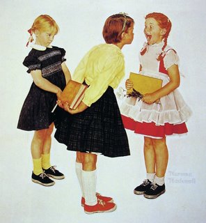
Say what you will about Rockwell's subject matter, but he was a master draftsman and storyteller. You can tell so much about every character in this picture just by the body language. In this case, the way the poses relate to each other is just as important as the poses themselves. As I mentioned, posing is an art from in itself, and has it's own set of principles. Say what?! That's right, if the 12 animation principles weren't enough, here are 28 from master animator and artist, the late Walt Stanchfield:
pose and mood
planes
straights and curves
shape and form
solidity
primary and secondary
anatomy
arcs
action
model or character
squash and stretch
staging and composition
weight
beat and rhythm
anticipation
line and silhouette
depth and volume
caricature
action and reaction
overlap and follow-through
details
perspective
timing
texture
direction
working from extreme
simplification
tension to extreme
positive & negative shapes
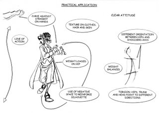
Notice that there are a some overlaps with the list of 12. Yes, you can indicate "anticipation" in a still drawing! A few of these are specific to drawing and don't concern the CG animator as much. I'm not going to go into all of these principles here, and I don't purport to have one one-hundredth the talent and experience of Stanchfield, but I think I know what he's talking about, at least. Walt's copious notes on the subject of figure drawing used to be posted over at Animation Meat, but apparently they've been taken down pending their publication of a book. That will definitely be a must-have title! At Pixar we are lucky (I could just end the sentence right here) to have animator and artist Tom Gately, who was a student of Stanchfield, and now instructs his own weekly figure drawing class. While I haven't been exactly regular in attendance (sorry, Tom), I have found that practicing my figure drawing with an emphasis on these principles has improved my drawing and my animation. Not all CG animators draw, but for a lot of us drawing thumbnails is an important part of planning. Knowing how to improve those initial sketches will help clarify your ideas before you get on to the computer. Personally I find that I push my drawings much further than I would be likely to push a CG character, so it's good to start with an extreme drawing rather than the limitations of a computer model.
In closing here's an image that Disney animator Sergio Pablos handed out during a visit to Pixar a few years back, which shows many of the above principles applied. Notice the similarities to the third Muhammad Ali pic, above. I hope Sergio doesn't mind me posting this... Thanks, Sergio!
That's all I've got to say for now. There went my Sunday night. Thanks for reading this far!
P.S. A good supplement to this article is Travis Hathaway's "my not necessarily the principles" post on Spline Doctors
gnarly stuff man. Your sunday night was well spent :). I really appreciate all the work you put into these posts, they REALLY help A LOT! I thought what you said about figure drawing was very interesting. As a requirement for the school I'm going to, around 95% of your portfolio to get in is said to be based on figure drawings, and this has kinda annoyed me because I always thought, "how can a drawing show talent for animation?". You've helped me see why :).
ReplyDeleteCarlos has a gnarly lesson quickie on "shapes/lines" that is along the same lines, no pun intended :P
http://www.carlosbaena.com/resource/resource_tips_shapes.html
and again, a HUMUNGO thanks for the work you put into these posts! you the man :D!
Really great post! =)
ReplyDeleteThanks a lot for sharing those thoughts with us.
Victor,
ReplyDeleteI suspect the Dr. Doppler drawing Andreas handed out at Pixar was drawn by Sergio Pablos (or one of the animators supervised by him). There's a bit of confusion about authorship in your post.
Matthew
Nate, thanks for the link to Carlos' article - I've added it in to the post.
ReplyDeleteMatthew - whoops, you're right! Andreas came to visit us, too, but it was Sergio who left that handout. I've fixed the article. Thanks for catching this!
Hi Victor,
ReplyDeleteI had the pleasure of watching the first part of the lecture you did for AM. From the start I noticed how well your poses were working and it inspired me to focus on that for my next shot. Its great fun to see you come up with a post about posing, a very nice coincidence.
On a side note, in the lecture your Intuos pen is covered with a brown piece of wood? or something similar, what mysterious improvement did you add?
Hey Victor just wanted to say like everyone else here, thanks a lot for your time in posting! It really helps me to get out of an animation slum when looking at posts and reference pictures like this.
ReplyDeleteSo thanks again!
Hi,Victor!
ReplyDeleteVery nice post! I've just translated this post into Chinese and post it here: http://johnchuangz.blogspot.com/2008/08/posing.html. I think some chinese animators need the translations. Although I've post your origin link url , I need your permission right? I'll delete that post immediately if you don't like it.
Thank you very much for sharing and your time!
Yo Victor, I sent you this previously via Flickr but I'd like you to see it here. It's a link to my roundtable discussion with John Kricfalusi, Friz Freleng, Joe Barbera and Bill Hanna.
ReplyDeleteCheers,
Noe Gold
aka Doctor Noe
aka Noe the G
Noe Gold wants you to see a photo
The Masters (Old and Young): Joe Barbera, John Kricfalusi, Jim Hanna, (seated) Friz Freleng
by Doctor Noe
© All rights reserved
Just follow this link to see the photo:
http://www.flickr.com/photos/doctor_noe/1868210892/
(If the link doesn't work, try copying and pasting it from this email into your browser's address bar.)
Here is the history of my concept of the first Hollywood Reporter Roundtable:
Friz Freleng (seated) Joe Barbera, Bill Hanna, John Kricfalusi in a photo by Aldo Mauro for the occasion of the Hollywood Reporter roundtable redacted by Noë Gold
The Masters: Joe Barbera, John Kricfalusi, Jim Hanna, (seated) Friz Freleng. From a proof sheet by Aldo Mauro.
Roundtable for The Hollywood Reporter conducted by features editor Noë Gold in 1998 when all these gents were still with us.
... And John Kricfalusi has posted the entire Roundtable transcript on the ASIFA website in two parts here ...
NoeTHR-FrelengHannaBarberaKricfalusi-1992-Pt1
ASIFA-Hollywood Animation Archive: Biography: John K Interviews ...
www.animationarchive.org/2006/04/biography-john-k-intervi...
Animation: John Kricfalusi and Noe Gold conduct the first Hollywood Reporter Roundtable with legendary animators Joe Barbera, Bill Hanna and Friz Freleng.
“Here is the first installment of a 1992 interview conducted by John Kricfalusi with Bill Hanna, Joe Barbera and Friz Freleng. Rarely do we have the opportunity to listen in as directors speak filmmaker to filmmaker. Although the candidness of some of the comments may surprise you, I think you'll agree that this may be one of the most illuminating interviews on the subject of animation ever conducted.” -Stephen Worth
INTRODUCTION by John Kricfalusi: “There has lately been a lot of talk of an animation Renaissance. Where is it? It hasn't happened. ... There certainly is a great upsurge of interest in cartoons, especially from adults. We all want it to happen. Animators want it to happen. Studio Executives want it to happen and most importantly; the public wants it to happen. ... In the 1940s, men like Bill Hanna, Joe Barbera, Friz Freleng and their contemporaries, Bob Clampett, Chuck Jones and Tex Avery, brought animated cartoons to their height of glory...”
Noe Gold from the Hollywood Reporter and I met with Joe Barbera, Bill Hanna and Friz Freleng in Mr. Barbera's office. ...
and here ...
NoeTHR-FrelengHannaBarberaKricfalusi-1992-Pt2
ASIFA-Hollywood Animation Archive: Biography: John K Interviews ...
www.animationarchive.org/2006/05/biography-john-k-intervi...
Animation: John Kricfalusi and Noe Gold conduct the first Hollywood Reporter Roundtable with legendary animators Joe Barbera, Bill Hanna and Friz Freleng.
This is a continuation of an interview by John Kricfalusi with Bill Hanna, Joe Barbera and Friz Freleng. If you missed it, please see Part One of John K Interviews Bill, Joe & Friz
INTRODUCTION by John Kricfalusi: Noe Gold from the Hollywood Reporter and I met with Joe Barbera, Bill Hanna and Friz Freleng in Mr. Barbera's office. ...
FRIZ & BILL AT HARMAN-ISING
Noe Gold: You gentlemen worked together at one point, didn't you?
Bill H: Friz and I worked together in 1930 for a company called Harman & Ising.
Friz F: And that was the beginning...
Bill H: The very beginning... Leon Schlesinger engaged them as a company to produce cartoons for them. After about two or three years, he decided to produce them himself, and that is when Friz and I parted company. I stayed with Hugh and Rudy, and Friz went to work with Leon.
Friz F: I knew I had to make a choice. It was either MGM or Leon Schlesinger. But they started making pictures with Jack King and Tom Palmer, and when I saw what what they made, I threw up. I figured it would be a cinch to make pictures better than that. Leon Schlesinger said I could have my own crew. Warners loved what we were making- Bosko in "Sinkin' in the Bathtub" and all that. ...
Henk, glad you liked the lecture. As for the thing around my Wacom stylus, it's just a foam tube. It makes gripping easier and is more ergonomic. I cut a slit in the side so I can still access the buttons. You can get your own here:
ReplyDeletehttp://www.gripworks.com/foam-tubing.htm
johnchuang, thanks for doing the translation.
hey victor, thanks for sharing so many great information and tips! I would like to translate this post to portuguese to share this good stuff with some brazilian and portuguese speaking animators. Is it possible?
ReplyDeleteThanks a lot!
Vivi
This comment has been removed by a blog administrator.
ReplyDelete