Saturday, January 19, 2013

Brave animation reel

Here is a compilation of the shots I animated for Brave:

Brave Reel from Victor Navone on Vimeo.

I was just going to animate a shot or two on Brave for fun… I never like to miss working on a Pixar feature if I can help it.  Then Brave production started missing deadlines, and they needed all the help they could get, so I was enlisted to be full-time on the show for about 3 months. Nevertheless it was still fun; working with Mark Andrews is a blast, and I got to do some juicy shots. I especially enjoyed the scene of Elinor eating the cake, and I did a lot of research on people trying to conceal disgust. Emma Thompson's vocal performance was hugely inspirational, and I referenced Lucille Ball and WIlliam Shattner as well.  On a technical note, this was the first time I ever had the chance to animate neck muscles.

As for the triplet shots, the snot gag was my idea. Love it or hate it, I thought it was true to young kids' behavior, and it ended up in the trailer!  I also came up with the chicken-on-the-head idea.  I don't claim think it's funny (mostly I think it's weird).  There were no storyboards for this sequence, and I was tasked with using the chicken in a way that would frighten Maudie but would be funny to the audience.  This was one of about 5 ideas I tried, and it seemed to get the best reaction.


You can see some of my planning drawings here:
flickr.com/photos/victor_navone/sets/72157632560536761/

Enjoy!

How To Ask For (And Receive) Good Critiques And Comments

I just read this article on Fstoppers (a photography blog) and I thought that a lot of it applies to animation too - or for that matter any creative endeavor.  Knowing how to ask for and accept feedback is just as important as the work you do.

Monday, January 07, 2013

The Blue Umbrella

Here's a short clip from an upcoming Pixar short film, The Blue Umbrella.  As you can see, this short has a very different aesthetic than anything we've done before, and I'm very excited to see it.  I haven't seen the entire short completed, but the few bits of final renderings I've seen have been stunning.  Enjoy:


Saturday, January 05, 2013

Norman Rockwell: Behind the Camera

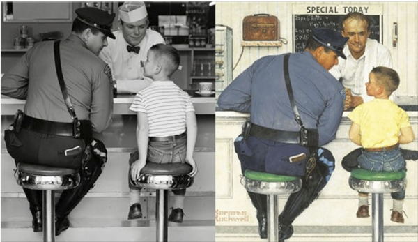
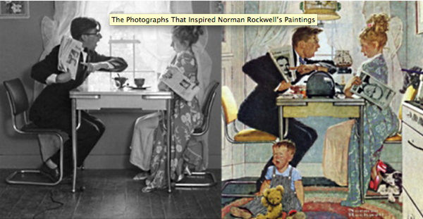
I've long been a fan of the illustrations of Norman Rockwell.  His sensibilities strike such a nice balance between realism and caricature, and above all he creates believable and entertaining images.  The characters are crystal clear, the situations are relatable, and the compositions are impeccable.  He is a wonderful observer of human nature, and he's got a great sense of humor!  I recently picked up the book Norman Rockwell: Behind the Camera, which shows a lot of the reference photography that he used for his paintings.  The photos themselves are very interesting to see; he staged his subjects very well, and was meticulous with the details such as costumes, props, and lighting.  What I really find interesting, however, is comparing the photos to the final rendered images.  Here you can see a little bit of Rockwell's thought process.  He picks up on certain nuances of character and exaggerates them, while he lets less important details fall away.  He exaggerates shapes, lines of action, expressions, and composition, all in the service of telling a story.  There are many parallels between the work of an illustration like Rockwell and the work of an animator, and I draw a lot of inspiration from him.  

51MDHXEZWGL SS500

Screen Shot 2013 01 05 at 5 57 46 PM

Screen Shot 2013 01 05 at 5 58 07 PM