Here's a little article I wrote about how to create consistency of characters in a feature film, and working in different styles of animation. This is something I'm dealing with a lot right now; the humans on Toy Story 3 are designed, and therefore animated, in a very naturalistic way. I couldn't animate a Toy Story human the same way I animate a Ratatouille human, for example. On Ratatouille the characters were a lot more stylized, so we could push their performances further and get pretty broad with them. On TS3, I find I'm relying on video reference a lot more, and having to work harder to get the mechanics and weight just right.
It's always important to listen to your director an supervisors, and pay attention to what other animators are doing with the characters.
Monday, September 21, 2009
Sunday, September 20, 2009
VNOG Blog - now even wider!
I have widened my blog template by over 30%, allowing me to embed larger images and videos. I'm sure you are all as excited about this as I am! Okay, as you were.
Wednesday, September 16, 2009
Pencil Test Depot
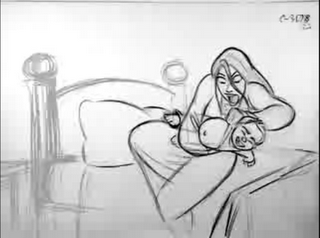
I just found this great blog that features only hand-drawn pencil tests from Disney films and elsewhere. Awesome inspiration awaits you! Thanks to Carlos Baena for the scoop.
Monday, September 14, 2009
Body Language
This past weekend I saw the film "In the Heat of the Night", starring Sidney Poitier and Rod Steiger. I had never seen it before and it's a wonderful film on many levels. I was particularly struck by the performances of the lead actors, and how much they convey with body language alone. The dialog is very understated, leaving a lot of room for the characters to communicate their thoughts and emotions physically. Watch this scene on YouTube, particularly from 0:20 through 1:03. Here the sheriff, played by Steiger, is trying to convince visiting detective, Poitier, to stay and help solve a murder. I wont spoil the rest of the movie for you, but suffice to say these characters don't like each other much, which adds a lot of tension to the scene.
Let's start with Rod Steiger's performance. In the first two shots, he's basically just holding a pose. Within that pose he's doing tiny head accents and moving in closer, but the rest is all in the face. I love how he's cocking his head to one side and getting in Poitier's face. This performance is wonderfully simple.
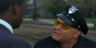
Throughout this film Poitier is the paragon of restraint, both in his words and in his movement. Here he's dead still, except for his eyes, but you can read so many emotions into it. I don't know if you could get away with this level of subtlety on an animated character; I suppose it would depend on how stylized the character is.
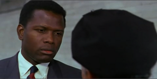
Finally, there's the wide shot. Steiger walks away, confident in his argument, and then stops and turns to allow us to focus completely on Poitier with him. Poitier pauses, as if he's still waiting for the train, then you see his resolve crumble, as he grudgingly realizes that he must stay. His stilted, boyish walk and the way he picks up the suitcase are so specific and entertaining to watch. Neither character will admit out-loud that they need each other, and their bodies communicate both resistance and acceptance. So juicy!
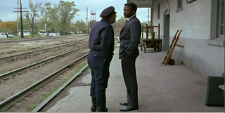
Scenes with this much depth, subtext and subtlety are rare in animated films, and I hope to see much more of them in the future. So often the writers feel like they have to have the characters say everything they are feeling; it's wonderful when the director can trust the animators to be actors and let them communicate non-verbally.

Throughout this film Poitier is the paragon of restraint, both in his words and in his movement. Here he's dead still, except for his eyes, but you can read so many emotions into it. I don't know if you could get away with this level of subtlety on an animated character; I suppose it would depend on how stylized the character is.

Finally, there's the wide shot. Steiger walks away, confident in his argument, and then stops and turns to allow us to focus completely on Poitier with him. Poitier pauses, as if he's still waiting for the train, then you see his resolve crumble, as he grudgingly realizes that he must stay. His stilted, boyish walk and the way he picks up the suitcase are so specific and entertaining to watch. Neither character will admit out-loud that they need each other, and their bodies communicate both resistance and acceptance. So juicy!

Scenes with this much depth, subtext and subtlety are rare in animated films, and I hope to see much more of them in the future. So often the writers feel like they have to have the characters say everything they are feeling; it's wonderful when the director can trust the animators to be actors and let them communicate non-verbally.
Dailies at Pixar
But wait, there's more! Here's a piece I wrote about the collaborative process of animation at Pixar, featured in this month's Animation Mentor Newsletter. Okay, shutting up now.
What is your favorite part...
...of the animation process? Find out my answer to this in my latest post on the Animation Tips & Tricks Blog. I'll give you a hint: it's not waiting for my shot to load. Feel free to mention your favorite part in the comments on the T&T site!
Wednesday, September 09, 2009
Rhythm and Texture
These are a couple of animation terms that get tossed around a lot, and many animators are not completely clear on exactly what they mean (I wasn't completely sure about them myself until well into my animation career). One reason I think they're so hard to pin down is that there's a lot of overlap (not that kind of overlap) between them, and it's hard to talk about one without referencing the other. Kind of like trying to talk about spacing without talking about timing and arcs. But lest I digress, I'm going to talk a bit about rhythm and texture as specifically as I can, and how important they are in your animation. I suppose I should attempt to define these terms before I go much further, so here's how I understand them:
Rhythm - how the actions or "beats" in a shot are spaced out over the length of a scene. You might also call this "tempo". Unlike with music, good animation has an inconsistent rhythm, making it less predictable.
Texture - the variations of timing and poses in your shot. Big and little actions, slow and fast timing, flurries of action and holds. A shot in which all the actions are the same size, have the same timing, and occur in an even rhythm has no texture.
Take a look at this clip from the classic Disney double-feature, "The Adventures of Ichabod and Mr. Toad". Here we see the hero, Ichabod Crane, wooing Katrina and evading fellow suitor, Brom.
There is plenty to be appreciated in this clip, but let's pay attention to the rhythm first. Notice how the first 4 pose changes on Ichabod are all timed about the same and are all spaced evenly in time - you can count out loud between the beats: "1-1000, 2-1000, 3-1000, 4-1000". In animation we generally try to avoid this kind of evenness in the timing; in music, a consistent rhythm is a good thing, but not in animation.* There's a method here, though: the animator is establishing a pattern so that he can break it. He gets the audience used to a certain rhythm so that when he changes it the audience is surprised. When Brom appears suddenly and tries to grab Ichabod the scene shifts into high speed. This contrast of rhythm creates emphasis - we know something important just happened. It's such a fast change that if it weren't staged perfectly, the audience would miss it and wouldn't understand the action. Notice how Brom hits his "grab" pose and holds it, and how Ichabod's hat floats in the air to tell you where his head "was", since there was no anticipation into his drop.
My favorite part of this scene is the next shot, where we cut inside the house and Ichabod is standing completely still, as if nothing just happened. The action of lifting his hat is tiny compared to all the big flourishes and the escape that proceeded the shot, and is isolated to just his arm. It's another big change in the rhythm and phrasing of the scene, and it not only reiterates Ichabod's composure in front of women, but also adds unexpected entertainment value. A few more quick actions (grabbing and presenting the flowers), and the sequence ends with Ichabod melting into a relaxed pose. All these changes in tempo, size of action and timing give the scene its texture.
The above clip is a pretty broad example, but you can achieve the same kind of texture in a smaller, simpler scene. Here's a clip from Monsters, Inc. featuring Sully, who is reacting to an offscreen sound.
Essentially, Sully is doing the same action over and over: he is looking around for the source of the sound. However, the animator has given the shot texture by varying the timing and size of the looks, as well as breaking up their distribution over the course of the shot to give it a more organic, staccato rhythm. Notice also that there is a progression in the looks; they start small, just in the eyes, then move on to progressively bigger and bigger moves involving the head and the torso. There's even a double-take to break up the tempo even more. The final look is the largest, and involves the biggest shape change in the body by incorporating the screen left arm. This gives the final look the most emphasis, because it's the point of the shot; this is when Sully will actually see the source of the sound (Boo playing with his tail).
Planning and blocking and animated scene is a complicated undertaking, and there are many things to keep in mind. It's not enough to obey the 12 animation principles. It's not enough to have original acting ideas and clear posing. You have to figure out the best combination of all these things to create your performance. Memorizing the dictionary and grammar rules does not make you a poet! You must find ways to string your ideas together lyrically to create a clear, cohesive, and of course, entertaining performance. You may come up with 4 great ideas for your shot, but the ideas might not flow together well. As important as your acting ideas are the changes between your ideas. What's more, the shot may only need 2 ideas. Try to be economical with your ideas, and find a sequence that flows together well. Figure out how little you need to do in the shot.
I usually start by just throwing out every idea I can on paper and/or video tape. Next I narrow it down to my favorite ideas that I think are most appropriate to the shot. From these I try to find the ideas that flow together naturally and create a nice progression, making sure that the biggest change occurs at the right time to emphasize the point of the shot. Once I have this phrasing worked out, I start to block my poses and actions into the computer. Now I can start to experiment with timing, playing with the speed of the individual actions and moving my beats around in time to try to break up the rhythm of the shot. The computer is great at helping you figure out your timing without wasting a lot of effort. This is how I find the texture in my animation. Usually after I've done my first blocking pass, I'll end up adding or removing an idea, or changing something from what I had planned to make it work better in the actual 3D scene. But no matter what I always play back the entire scene to make sure it has a pleasing texture. Always check the texture not only across the single shot that you're working on, but across the entire sequence. Remember to look at your work in context!
* What if you're animating to music? If a character is singing or dancing you want to respect the overall rhythm of the music, of course, making sure you regularly accent the beats of the music. But you must also look for places where you can add accents that fall outside the music's tempo. If you stay slavishly locked to the same beat, the animation will quickly become boring to watch. Have some accents fall on down beats, some on upbeats, some between beats. Have some actions happen in double-time, some in half-time. Remember that whenever you stray from the tempo of the music, you create emphasis, so do it wisely! Check out this vintage Flat Eric clip:
Note how he hits the down beat for most of the clip, but occasionally he breaks into a new rhythm, or skips a beat for emphasis (around 00:23). These little changes in the rhythm keep the clip entertaining to watch.
Thanks for reading!
Tuesday, September 08, 2009
Spline editing post
Here's another post I did on the Animation Tips and Tricks blog, this time about spline editing. If you want some more in-depth info on splines, check out my tutorials here. You can see some of my previous T&T posts on the main page, as well as some tips from Shawn Kelly.
Sorry for the cross-post; I'm composing an original post on texture in animation right now, so stay tuned!
Sorry for the cross-post; I'm composing an original post on texture in animation right now, so stay tuned!
Subscribe to:
Comments (Atom)
