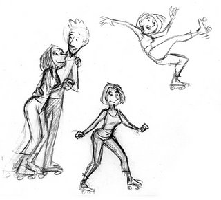
I periodically get requests from students and others to see some of my planning drawings, so I've put together a little gallery of some of my favorites from past projects. They're not meant to stand alone as good drawings, but you might find them interesting as an example of the thinking that goes into my work at Pixar and AnimationMentor.com. I've included a bunch from my one Ratatouille shot, which I linked in a previous post.
wow! very nice thumbnails. Mine are usually just stick figures. It cool too see nice drawings like this.
ReplyDeleteThese are really awesome. Would be great if we could see some of the rougher, not so favorite ones :-P just to get an idea of the range, really interesting the firrences between exploratory thumbnails and planning thumbnails
ReplyDeleteJonathan, I tried to include a wide variety. Some of the Dash running ones are stick figures, and some of the Syndrome ones are extremely loose. I chose thumbnails that I thought communicated my ideas the best. These pretty fairly represent the range of style and detail levels that I work at.
ReplyDeletewow, sweet. need to work on making my thumbnails better, haha!
ReplyDeleteMaybe this is too in depth, but how do you decide how far to take a thumbnail? I mean, many times I have very loose thumbnails, and i wonder if it is better making them more refined. Like, even the stick figures have all of the motion etc defined and of the correct proportions for the character.
Anyways, again, huge thanks for this post. It's really nice to see such awesome thumbnails, with such clear and readable posing.
Jonathan, the purpose of a thumbnail is just to communicate the important facts about a pose. For instance, the angle of the hips and shoulders, the curve of the spine, the placement of the feet, etc. Some rudimentary facial expressions may also be in order, depending on the shot. As long as you can clearly communicate these things to yourself (and anyone you may need to show them to) that is far enough. That said, as someone who likes to draw I often find myself embellishing my thumbs with more detail than they need, just because I enjoy the process!
ReplyDeleteAwesome! I find my thumbnails are very rough, and basically stick figures, but they do what they intend to do. They definitely help me in preparing for any animations I do for my class.
ReplyDeleteNice, Victor. Do you actually animate Syndrome do the line from The Shining? Can we see it?
ReplyDeleteHey Victor, thanks for posting these thumbs. I especially like your thumbs on how you worked out the Colette spin. Taking a look at your behind the scenes process is invaluable and gold! Thanks!
ReplyDelete-Carlos
Alex, no I didn't. Wait, you were there working on The Incredibles with me! You know better!
ReplyDeleteThis may be a silly question.. Once you get your boards, how close must you follow them when planning and thumbnailing?
ReplyDeleteDude, those thumbs are amazing! I love them! The ones of Colette skating... holy crap! Ridiculous.
ReplyDeleteI started looking at your reels and I just realized the you animated my favorite shot in Cars! "My friend, Guido, he dream to give a real race car a pit stop." Guido bouncing back and forth. Pure genius! I talk about that shot every time we watch Cars which is a lot because my son won't have a good morning without "Eye-ning" and "Sheff".
Thanks for posting those thumbnails!
Thanks for the awesome response! I really appreciate it and the tutorials and everything you put up here. It's really eye opening stuff.
ReplyDeleteThanks for sharing these! Very Inspirational!
ReplyDeleteAbsolutely fantastic stuff Victor, thank you for putting it online.
ReplyDeleteAlthough, it's somewhat disheartening to see these 'thumbnails' & then look at my *own*. Which by comparison look like they were drawn by a rhinoceros, on a treadmill, in a nightclub. With it's face.
I am envy & awe.
Jorge, it depends on the boards. Sometimes they're very specific and indicate exactly what the director wants, so I try to match them as best I can. Other times the boards are loose and just suggest the main beats of the shot, so I try to make it my own.
ReplyDeleteSugartastic - Thanks!
AJ - if it's any consolation, there are plenty of animators at Pixar who can draw much better than I do, and they make me feel the way you just described about my work...
From your Cars reel I see that you got TONS of shots. You must animate like greased lightning. So how long did it take you to animate your shot in Ratatouille?
ReplyDeleteThis blog is incredible, I found this post really helpful. I've been thinking about my work processes and how I should go about referencing in general. seeing this makes me feel better about my decisions. I gonna come back here, I have lots to learn. Thanks again
ReplyDeleteVery cool Victor. I almost like the more rough ones more than I do the more refined ones, most likely because of the movement and the emotion that they convey. Ugh, back to the drawing board! ^_^
ReplyDelete~N
Sugartastic - I think I worked on that one for about a month. I was doing it on my "spare" time, though, so I don't know how many hours I spent.
ReplyDeleteThanks for this gallery, it's very interesting!
ReplyDelete