Saturday, December 26, 2009
Help the Hodges
Sunday, December 20, 2009
Thursday, December 10, 2009
Milt Kahl: The Animation Michelangelo
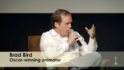
I don't know how long these have been online, but there are some clips on the Oscars.org site from the Milt Kahl retrospective they held in April of this year. Includes lots of good anecdotes from a variety of animators and relatives, and even some of Brad Bird recounting his tutelage under Kahl. Unfortunately there is not supporting footage of Kahl's work, but that's just a Google (or a DVD) away.
Wednesday, December 09, 2009
Meindbender Studios
Saturday, November 21, 2009
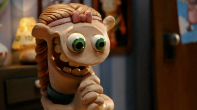
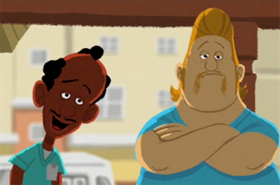
George & AJ
Tuesday, November 10, 2009
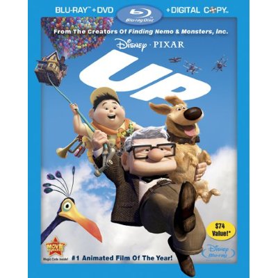
"Up" on DVD today
Monday, October 12, 2009
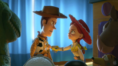
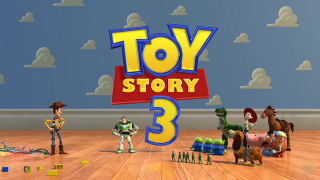
Toy Story 3 Trailer
Here's what we've been working on. I've been enjoying working on this show a lot more than I expected, and I'm pretty proud of some of the work I've done (which is a big deal for me). None of my shots appear in the trailer, so I guess you'll have to wait until next June to see 'em. Enjoy!
Saturday, October 03, 2009
Alien Song: 10 years later
It's hard for me to believe, but it's been 10 years since I finished Alien Song and it began its viral spread across the internet. I had been working on it for a few months, and sharing iterations of it with the CG-Char Forum to get feedback from other animators. Once I sent out the complete version, the list members started passing it around, and it eventually spread into mainstream email circulation, alongside the Dancing Baby. I had never intended for this clip to go beyond the confines of the forum, much less catapult me into a new career. There was no YouTube back then, of course, so it choked a lot of email servers in the process. I received thousands of emails in the ensuing months, but best of all was this one, dated November 15th, 1999:
Hi Victor,
I saw your Alien Song animation and really liked it. Would you
consider interviewing with Pixar? If so, send me an email and
we'll set something up.
Thanks,
Ed Catmull
Pixar
I had to resurrect some archived email to find this, and I'm glad I still have it! This was two weeks after I had left my job at Presto Studios in San Diego to pursue film work in the San Francisco Bay Area. I was hoping to get into ILM to work on the Star Wars prequels. I interviewed with them three separate times, and luckily they never hired me! Pixar interviewed me in December, if memory serves, but I didn't start working there until March 14th, 2000. In the meantime I was doing some freelance work, including some visual effects for the film "Titan AE".
In addition to helping me land a job at Pixar, Alien Song got me a lot of attention on the internet (which was still pretty young), and a phone-call from Gloria Gaynor's (singer of I Will Survive) publicist. I was happy to hear that they weren't going to sue, considering I never licensed the music! Suddenly I was being asked to speak at CG and animation festivals around the world, and I even got some licensing deals. Of course for every legitimate business offer I got, there were 30 or so that were suspicious or never panned out.
Those were heady times. The internet bubble had yet to burst, computer animation was still in its infancy, no one had heard of Al Qaeda, and the iPod was just a twinkle in Steve Jobs' eye. My demo reel at the time was comprised mainly of Alien Song, a couple of other Blit tests, and some FX and CG work. I doubt I could get an interview at Pixar with the same reel today. It's a lot bigger company now, and there is a lot more competition out there, especially with schools like AnimationMentor.com cranking out skilled animators left and right. I am one lucky guy...
You can read about my process for creating Alien Song here, and there's a FAQ as well.
Monday, September 21, 2009
Working in different styles
Here's a little article I wrote about how to create consistency of characters in a feature film, and working in different styles of animation. This is something I'm dealing with a lot right now; the humans on Toy Story 3 are designed, and therefore animated, in a very naturalistic way. I couldn't animate a Toy Story human the same way I animate a Ratatouille human, for example. On Ratatouille the characters were a lot more stylized, so we could push their performances further and get pretty broad with them. On TS3, I find I'm relying on video reference a lot more, and having to work harder to get the mechanics and weight just right.
It's always important to listen to your director an supervisors, and pay attention to what other animators are doing with the characters.
It's always important to listen to your director an supervisors, and pay attention to what other animators are doing with the characters.
Sunday, September 20, 2009
VNOG Blog - now even wider!
I have widened my blog template by over 30%, allowing me to embed larger images and videos. I'm sure you are all as excited about this as I am! Okay, as you were.
Wednesday, September 16, 2009
Pencil Test Depot
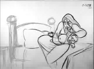
I just found this great blog that features only hand-drawn pencil tests from Disney films and elsewhere. Awesome inspiration awaits you! Thanks to Carlos Baena for the scoop.
Monday, September 14, 2009
Body Language
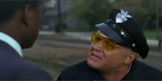
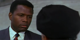
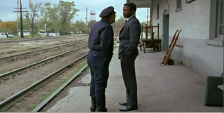
This past weekend I saw the film "In the Heat of the Night", starring Sidney Poitier and Rod Steiger. I had never seen it before and it's a wonderful film on many levels. I was particularly struck by the performances of the lead actors, and how much they convey with body language alone. The dialog is very understated, leaving a lot of room for the characters to communicate their thoughts and emotions physically. Watch this scene on YouTube, particularly from 0:20 through 1:03. Here the sheriff, played by Steiger, is trying to convince visiting detective, Poitier, to stay and help solve a murder. I wont spoil the rest of the movie for you, but suffice to say these characters don't like each other much, which adds a lot of tension to the scene.
Let's start with Rod Steiger's performance. In the first two shots, he's basically just holding a pose. Within that pose he's doing tiny head accents and moving in closer, but the rest is all in the face. I love how he's cocking his head to one side and getting in Poitier's face. This performance is wonderfully simple.
Throughout this film Poitier is the paragon of restraint, both in his words and in his movement. Here he's dead still, except for his eyes, but you can read so many emotions into it. I don't know if you could get away with this level of subtlety on an animated character; I suppose it would depend on how stylized the character is.
Finally, there's the wide shot. Steiger walks away, confident in his argument, and then stops and turns to allow us to focus completely on Poitier with him. Poitier pauses, as if he's still waiting for the train, then you see his resolve crumble, as he grudgingly realizes that he must stay. His stilted, boyish walk and the way he picks up the suitcase are so specific and entertaining to watch. Neither character will admit out-loud that they need each other, and their bodies communicate both resistance and acceptance. So juicy!
Scenes with this much depth, subtext and subtlety are rare in animated films, and I hope to see much more of them in the future. So often the writers feel like they have to have the characters say everything they are feeling; it's wonderful when the director can trust the animators to be actors and let them communicate non-verbally.

Throughout this film Poitier is the paragon of restraint, both in his words and in his movement. Here he's dead still, except for his eyes, but you can read so many emotions into it. I don't know if you could get away with this level of subtlety on an animated character; I suppose it would depend on how stylized the character is.

Finally, there's the wide shot. Steiger walks away, confident in his argument, and then stops and turns to allow us to focus completely on Poitier with him. Poitier pauses, as if he's still waiting for the train, then you see his resolve crumble, as he grudgingly realizes that he must stay. His stilted, boyish walk and the way he picks up the suitcase are so specific and entertaining to watch. Neither character will admit out-loud that they need each other, and their bodies communicate both resistance and acceptance. So juicy!

Scenes with this much depth, subtext and subtlety are rare in animated films, and I hope to see much more of them in the future. So often the writers feel like they have to have the characters say everything they are feeling; it's wonderful when the director can trust the animators to be actors and let them communicate non-verbally.
Dailies at Pixar
But wait, there's more! Here's a piece I wrote about the collaborative process of animation at Pixar, featured in this month's Animation Mentor Newsletter. Okay, shutting up now.
What is your favorite part...
...of the animation process? Find out my answer to this in my latest post on the Animation Tips & Tricks Blog. I'll give you a hint: it's not waiting for my shot to load. Feel free to mention your favorite part in the comments on the T&T site!
Wednesday, September 09, 2009
Rhythm and Texture
These are a couple of animation terms that get tossed around a lot, and many animators are not completely clear on exactly what they mean (I wasn't completely sure about them myself until well into my animation career). One reason I think they're so hard to pin down is that there's a lot of overlap (not that kind of overlap) between them, and it's hard to talk about one without referencing the other. Kind of like trying to talk about spacing without talking about timing and arcs. But lest I digress, I'm going to talk a bit about rhythm and texture as specifically as I can, and how important they are in your animation. I suppose I should attempt to define these terms before I go much further, so here's how I understand them:
Rhythm - how the actions or "beats" in a shot are spaced out over the length of a scene. You might also call this "tempo". Unlike with music, good animation has an inconsistent rhythm, making it less predictable.
Texture - the variations of timing and poses in your shot. Big and little actions, slow and fast timing, flurries of action and holds. A shot in which all the actions are the same size, have the same timing, and occur in an even rhythm has no texture.
Take a look at this clip from the classic Disney double-feature, "The Adventures of Ichabod and Mr. Toad". Here we see the hero, Ichabod Crane, wooing Katrina and evading fellow suitor, Brom.
There is plenty to be appreciated in this clip, but let's pay attention to the rhythm first. Notice how the first 4 pose changes on Ichabod are all timed about the same and are all spaced evenly in time - you can count out loud between the beats: "1-1000, 2-1000, 3-1000, 4-1000". In animation we generally try to avoid this kind of evenness in the timing; in music, a consistent rhythm is a good thing, but not in animation.* There's a method here, though: the animator is establishing a pattern so that he can break it. He gets the audience used to a certain rhythm so that when he changes it the audience is surprised. When Brom appears suddenly and tries to grab Ichabod the scene shifts into high speed. This contrast of rhythm creates emphasis - we know something important just happened. It's such a fast change that if it weren't staged perfectly, the audience would miss it and wouldn't understand the action. Notice how Brom hits his "grab" pose and holds it, and how Ichabod's hat floats in the air to tell you where his head "was", since there was no anticipation into his drop.
My favorite part of this scene is the next shot, where we cut inside the house and Ichabod is standing completely still, as if nothing just happened. The action of lifting his hat is tiny compared to all the big flourishes and the escape that proceeded the shot, and is isolated to just his arm. It's another big change in the rhythm and phrasing of the scene, and it not only reiterates Ichabod's composure in front of women, but also adds unexpected entertainment value. A few more quick actions (grabbing and presenting the flowers), and the sequence ends with Ichabod melting into a relaxed pose. All these changes in tempo, size of action and timing give the scene its texture.
The above clip is a pretty broad example, but you can achieve the same kind of texture in a smaller, simpler scene. Here's a clip from Monsters, Inc. featuring Sully, who is reacting to an offscreen sound.
Essentially, Sully is doing the same action over and over: he is looking around for the source of the sound. However, the animator has given the shot texture by varying the timing and size of the looks, as well as breaking up their distribution over the course of the shot to give it a more organic, staccato rhythm. Notice also that there is a progression in the looks; they start small, just in the eyes, then move on to progressively bigger and bigger moves involving the head and the torso. There's even a double-take to break up the tempo even more. The final look is the largest, and involves the biggest shape change in the body by incorporating the screen left arm. This gives the final look the most emphasis, because it's the point of the shot; this is when Sully will actually see the source of the sound (Boo playing with his tail).
Planning and blocking and animated scene is a complicated undertaking, and there are many things to keep in mind. It's not enough to obey the 12 animation principles. It's not enough to have original acting ideas and clear posing. You have to figure out the best combination of all these things to create your performance. Memorizing the dictionary and grammar rules does not make you a poet! You must find ways to string your ideas together lyrically to create a clear, cohesive, and of course, entertaining performance. You may come up with 4 great ideas for your shot, but the ideas might not flow together well. As important as your acting ideas are the changes between your ideas. What's more, the shot may only need 2 ideas. Try to be economical with your ideas, and find a sequence that flows together well. Figure out how little you need to do in the shot.
I usually start by just throwing out every idea I can on paper and/or video tape. Next I narrow it down to my favorite ideas that I think are most appropriate to the shot. From these I try to find the ideas that flow together naturally and create a nice progression, making sure that the biggest change occurs at the right time to emphasize the point of the shot. Once I have this phrasing worked out, I start to block my poses and actions into the computer. Now I can start to experiment with timing, playing with the speed of the individual actions and moving my beats around in time to try to break up the rhythm of the shot. The computer is great at helping you figure out your timing without wasting a lot of effort. This is how I find the texture in my animation. Usually after I've done my first blocking pass, I'll end up adding or removing an idea, or changing something from what I had planned to make it work better in the actual 3D scene. But no matter what I always play back the entire scene to make sure it has a pleasing texture. Always check the texture not only across the single shot that you're working on, but across the entire sequence. Remember to look at your work in context!
* What if you're animating to music? If a character is singing or dancing you want to respect the overall rhythm of the music, of course, making sure you regularly accent the beats of the music. But you must also look for places where you can add accents that fall outside the music's tempo. If you stay slavishly locked to the same beat, the animation will quickly become boring to watch. Have some accents fall on down beats, some on upbeats, some between beats. Have some actions happen in double-time, some in half-time. Remember that whenever you stray from the tempo of the music, you create emphasis, so do it wisely! Check out this vintage Flat Eric clip:
Note how he hits the down beat for most of the clip, but occasionally he breaks into a new rhythm, or skips a beat for emphasis (around 00:23). These little changes in the rhythm keep the clip entertaining to watch.
Thanks for reading!
Tuesday, September 08, 2009
Spline editing post
Here's another post I did on the Animation Tips and Tricks blog, this time about spline editing. If you want some more in-depth info on splines, check out my tutorials here. You can see some of my previous T&T posts on the main page, as well as some tips from Shawn Kelly.
Sorry for the cross-post; I'm composing an original post on texture in animation right now, so stay tuned!
Sorry for the cross-post; I'm composing an original post on texture in animation right now, so stay tuned!
Monday, August 24, 2009
Animator Tips & Tricks
I know I haven't been posting much original content here of late, but maybe this will help: I'm this month's guest blogger on the Animation Tips & Tricks blog, brought to you by the good people at AnimationMentor.com. My first post is a response to the question, "What separates the good animator from the bad animator?" Be sure to read the comments too, as I added some additional thoughts there. Enjoy!
Monday, August 03, 2009
Wednesday, July 29, 2009
Toy Story Double Feature trailer
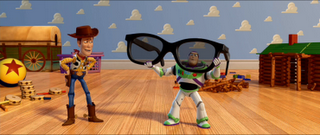 Check out this new trailer for Toy Story 1 and 2, which will be rereleased in theaters in 3D this Fall. Of course the trailer itself is better seen in a theater in 3D, but it's still pretty good on your computer.
Sunday, July 26, 2009
Comic Con!
I just got back from Comic Con in San Diego. It was great to see some old friends (and my Mom) and dive into the sea of geek. You really can't grasp the size of this event without seeing it first hand. To that end, I've posted a bunch of photos, including some from "Flynn's Arcade", a replica of the arcade in the original Tron, built in a warehouse in downtown SD as part of a promotional gimmick.
I also got into the Disney 3D panel, hosted by John Lasseter, where they showed clips from upcoming films. We saw the new 3D teaser for the Toy Story 1&2 double feature, the opening sequence of Toy Story 2 in 3D, a Toy Story 3 teaser (featuring Ken), some Beauty and the Beast in 3D, and two sequences from The Princess and the Frog. Then Hayoa Miyazaki showed up and premiered a clip from Ponyo. Lasseter and Miyazaki were given honorary Inkpot awards for there contributions to animation. Patton Oswalt was there to moderate the ensuing panel, which featured John Lasseter, Lee Unkrich, Kirk Wise, Ron Clements, John Musker, and Miyazaki.
There was an Avatar panel featuring James Cameron that I would have liked to attend, but I didn't want to have to wait in line for hours. I also missed the panel on Walt Stanchfield, which really bummed me out. Luckily, Animation Mentor recorded the event and will be sharing it online for free!
Wednesday, July 08, 2009
CG Overdrive, Singapore photos up on Flickr

Shortly after I returned from Singapore the cooling system on my Mac G5 leaked and fried the power source. I finally got it back on Sunday and I'm slowly catching up on everything, including posting photos from my travel. I haven't added a lot of useful descriptions yet, but hopefully you can still enjoy them. I gave a 5-hour (gasp) lecture on animation research, planning and blocking. It was a fun event, and best of all I got to hang out with lots of other talented artists, including Craig Mullins, Feng Zhu and Alex Alvarez. We had lots of great food and leveraged our jet lag to help us party to the wee hours. I also got to tour the Lucasfilm studios there, and I even met a few Animation Mentor students. I'm already looking forward to my return visit!
Wednesday, July 01, 2009
Nail Art
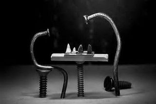
Here is an amazing compilation of photos of... Nails. Not only are these fun to look at, but they are great examples of how staging, lighting and line of action can tell a story visually. Note how the shapes of the nails can communicate emotion, intent, physical state, and even age. When two or more nails are present in the frame, you can deduce their relationship by the contrast and/or affinity of their poses, their relative sizes, and their spacial placement. Enjoy!
Tuesday, June 23, 2009
Mowgli animation by Milt Kahl
Milt Kahl (Mowgli) from Victor Ens on Vimeo.
I don't know if this has been posted around, but it's always inspirational to look at some well-drawn animation. And of course Milt Kahl is the king of well-drawn animation! Check out the weight, timing and solid draftsmanship in this clip! We are not worthy. While you're looking at that, I'll be busy trying to get together some photos from CG Overdrive to post. Stay tuned!
Sunday, June 14, 2009
I'll be at CG Overdrive in Singapore next week

If you're planning on being in Singapore next week, why not swing by the annual CG Overdrive Conference? I'll be giving a couple of animation lectures there, along with fellow Pixar Animator John Collins. Alex Woo from Pixar's story department will also be speaking there, as will be plenty of other industry professionals, and it should be a good time. I'm looking forward to some BBQ stingray, myself!
Friday, June 05, 2009
Partly Cloudy on iTunes
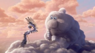
If you've seen UP, then you've (hopefully) also seen the charming short film that precedes it, Partly Cloudy. Of course it looks best on the big screen - and it's pretty neat in 3D, too - but you can purchase and download it from the iTunes store right now!
Friday, May 29, 2009
Stocks down? Go see UP!
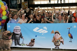
Pixar had the honor of ringing the bell to close the New York Stock Exchange today, while celebrating the opening of our latest feature, Up. You can see info and a clip of the event here (look for me near the back row - I'm one of the greenish pixels). You can't do any more trading, so why not go see the film? Right now. I'll wait.
Tuesday, May 19, 2009
Meet the Spy
Here's another brilliant cinematic sequence from the guys at Valve. It was about a year ago that I posted some other Team Fortress 2 Character Trailers, and I'm glad to see they're still making them! Great writing, design and animation, and a healthy dose of sex and violence.
And in case you missed this one (like I did) here's Meet the Sniper. Enjoy!
UPDATE: You can see all the character movies in high quality here.
Sunday, May 17, 2009
Some old stuff
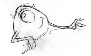
Enough of all this new stuff, let's jump in the Way-Back Machine! It's the summer of 1999, I've been hired as an animator at Pixar and I'm working on "Monsters, Inc." - the other Pete Docter film. I have no feature film animation experience (or much of any animation experience at all), I'm still getting the hang of Pixar's software and I'm worried that I'll get canned as soon as they find out I'm winging it! These are the memories that returned to me as I was thumbing through a stack of old planning drawings I did for Monsters. For posterity I've uploaded a few to my Animation Thumbs Gallery. It's nice to see that my drawing has gotten better, and I'm pretty confident that my animation has, too. They haven't fired my yet, so I must be doing something right!
Wednesday, May 13, 2009
Up at the Cannes Film Festival
In case you weren't aware, "Up" had the honor of being the opening selection at this year's Festival de Cannes. It was screened in 3D with subtitles to rave reviews. Here's a video of an ensuing press conference with Director Pete Docter, Co-Director Bob Peterson, Producer Jonas Rivera and Executive Producer John Lasseter.
Monday, May 11, 2009
This One Time...
This one time... from nelson boles on Vimeo.
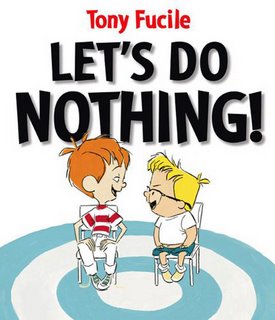
Here's a great animated short by CalArts student Nelson Boles. I really love the look of it and the whimsical style and storytelling.Let's Do Nothing!
I hate to recycle other people's blog posts, but I wanted to spread the word on this. Jim Capobianco's Leonardo blog mentions a new children's book by animator Tony Fucile (Incredibles, Iron Giant, etc.) coming out this week. It's called "Let's Do Nothing", and there's even a trailer animated by Fucile himself! The book's publisher has posted an interview with Fucile here, in PDF format.
Tuesday, April 28, 2009
A Close Shave
Monday, April 27, 2009
AWN: Pete Sohn talks about "Partly Cloudy"
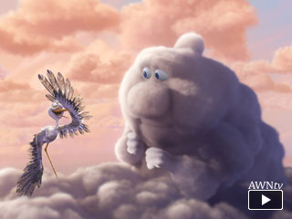
Here's an interview on Animation World Network with Pete Sohn, Director of Pixar's latest short film, "Partly Cloudy". This short will be in front of "Up" next month. I had the pleasure to seeing both at the Up wrap party this past weekend, and I can tell you, you're in for two treats! Both films are charming and beautiful. Up will probably make you cry at least twice, so bring Kleenex. You've been warned.
Friday, April 03, 2009
Friday, March 27, 2009
Adrenaline Lemmings
Check out this cool clip from Crew 972, a studio run by my old friend Alex Orrelle:
Adrenaline Lemmings CGI test from Alex Orrelle on Vimeo.
Adrenaline Lemmings CGI test from Alex Orrelle on Vimeo.
Wednesday, March 18, 2009
Friday, March 06, 2009
New Up Trailer Up
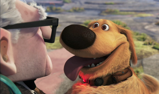
Pixar Represent!
Be sure to watch the trailer in HD, not the crappy video embedded in the page. I didn't work on Up (but for one measly shot) but it's looking great and I can't wait to see it! Definitely very original. If previous teasers and trailers didn't make you want to see it, I think this one will.
Sunday, February 22, 2009
VES Awards
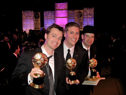
So Candy scooped me on this, but it's only fair since she ended up stuck at home with the kids. It was a great night for all of us Pixarians, and a real honor to be recognized by the VES. Neat trophy, too! The official category name was "Outstanding Animated Character in an Animated Motion Picture" and I shared the award with Designer Jay Shuster, Modeler/Articulator Austin Lee, and legendary Sound Designer Ben Burtt (Ben couldn't be there since he was accepting a lifetime achievement award at another ceremony). WALL-E also won for Outstanding Visual Effects in an Animated Motion Picture and Outstanding Animation in an Animated Motion Picture. Right after I received the award I came down with a messy stomach virus which kept me in my hotel bathroom for the rest of the night. I just don't have luck with my health at awards ceremonies. Sorry to anyone at the Century Plaza Hotel who had to clean up my mess!
It looks like WALL-E just nabbed the Oscar for Best Animated Feature, too, so it's a good weekend for us. Thanks to all who left nice comments!
Victor Won the VES Character Animation Award Last Night
Posted by the Wife. Just thought you would all like to know. Obviously I couldn't be more proud of him and it's about time! A full list of winners on the Visual Effects Society website in PDF format can be found here.
I am sure he will swoop in and edit this when he returns. And he'll also point out that it was in the Animated Feature category.
I am sure he will swoop in and edit this when he returns. And he'll also point out that it was in the Animated Feature category.
Monday, February 16, 2009
WALL-E: Design With A Purpose

There's an interesting, in-depth interview with Ralph Eggleston, Production Designer for WALL-E, on the Animation Art Conservation site. Ralph talks about the process of designing the look of the film, and there are some great examples of preproduction art which you can compare to the final film frames.
Sunday, February 15, 2009
James Brown shows you how to dance
I stumbled upon this on LiveLeak. James has some amazing moves, and it's great to see all the dances whose names I've heard of but never knew what they were. And how about that outfit? This clip is definitely worth downloading and framing through for animation reference. Watch how he bows his knees out to change the shape of his silhouette and create graphic squash and stretch! Hit me!
Friday, February 06, 2009
The Brows Have It
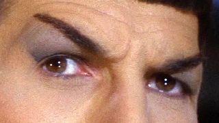
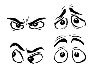
I wanted to do a post about eyebrows after seeing Carlos' post on his blog. If you haven't read it, you might as well do it now, since I'm not covering the same material here. Eyebrows are one of the most important parts of facial animation. Sure, the eyes are the "windows to the soul", but the brows are, like, the window dressing. Okay, that's a crappy stretch of the metaphor. Eyebrows are hugely expressive, though, and can go a long way towards communicating your character's thoughts and emotions. They are capable of bigger shape changes than the eyes alone, and often read better from a distance. Brows also change the shape of the eye; make the shape of your character's upper lids echo the shape of the brows so they feel connected and fleshy.
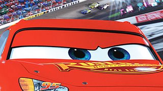
 If your character doesn't have brows (such as the characters in Cars) then you must use the upper lids to mimic the behavior of brows.
One of my favorite actors to look at for brow expressions is George Clooney (and let's face it, he's pretty easy on the eyes all around!). George has dark, prominent brows and his white scleras stand out against his dark skin, making for really clear, graphic expressions. He also has great comic timing, and when he's directed by the Coen Brothers you end up with some really entertaining performances, like this scene from "Intolerable Cruelty" (click picture to play movie):
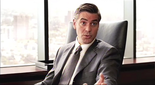
See how clear his attitudes are and how the brow changes lead his turns. He actually does very few gestures and pose changes; most of the acting is in the brows, eyes and the angle of the head. I also love how the wrinkles in his forehead echo the shapes of his brows and emphasize the accents. Here are some choice frames:
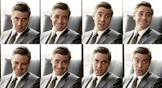
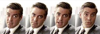
Animation tip: have your brow animation precede any head or body movement. Otherwise the brow action will be lost in the movement and the audience will miss it. This technique also helps to make the character look like he's thinking before he's acting.
Below are some stills from a scene in Ratatouille (animated by Michal Makarewicz), in which the deposed chef Skinner tastes the titular dish. Skinner is largely hidden behind the table and his sunglasses, so his brows end up doing much of the acting. You can clearly see the sequence of his emotions in his brow: angry determination, surprise, ecstasy, and back to anger.

And here are some interesting behavioral facts about brows:
- As the pitch of the voice raises the brows go up
- As the pitch of the voice lowers, the brows likewise drop
- When asking a question where the answer is already known, the brows raise
- When asking a question where the answer is truly unknown, the brows lower
- Spontaneous facial expressions (surprise, fear, pain, etc.) tend to be symmetrical, where as expressions we choose to make (curiosity, suspicion, contempt, etc.) can be more asymmetrical.
I'm not going to break down all the muscles involved in brow animation, but I'd like to give special mention to the Corrugator muscle, which pulls the brows together in the middle and results in a tell-tale furrowing above the nose. This is important for intense expressions:
- Anger
- Fear
- Sadness
- Concentration
- Stress
- Disgust
- Deep thought
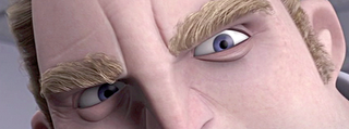
Note that you can't raise your brows and furrow them at the same time. You can raise the inner brows and furrow them, which gives a sad expression, and usually results in a twisted fleshy mass as the muscles pull the skin in different directions. It's a good idea to study facial anatomy to help you understand how the muscles of the face work. You don't have to memorize all the muscles' names (I haven't) but it will help you understand how to make more natural expressions and movements. It's also a good idea to study behavioral science to give you some insight into when, how and why humans make the faces they do. Here is some recommended reading on these topics:
The Artist's Complete Guide to Facial Expression by Gary Faigin
Unmasking the Face by Paul Eckman and Wallace Friesen
Manwatching by Desmond Morris
I hope you have enjoyed browsing this article.
Thursday, February 05, 2009
VES Nominations Sneak Peak in LA
On Saturday, February 7, the VES and the UCLA Film and TV Archives are jointly sponsoring a Sneak Peek event at the Billy Wilder Theatre in the Armand Hammer Museum in Westwood. Several groups of nominees will have the opportunity to present their nominated submissions and answer questions.I'll be there with the Pixar team talking about our WALL-E work, so feel free to come heckle us if you're in the LA area. It's free! More info here.
Wednesday, February 04, 2009
D'oh!
Okay, so obviously I didn't win the Annie. But at least I lost to James Baxter, who is one of the greatest animators working today. It was a rough weekend all around - I was sick during the awards ceremony and I couldn't party with my Pixar pals afterward because we were taking the kids to Disneyland the next morning. Ah well, I'm still looking forward to the VES awards! In the meantime, AnimationMentor student Adam Juhasz was kind enough to award me this:
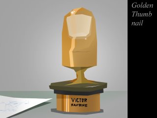
I'd like to thank Adam, Pixar, Andrew Stanton, my wife Candy, my daughters, all those who read my blog, and of course, my thumbs!

I'd like to thank Adam, Pixar, Andrew Stanton, my wife Candy, my daughters, all those who read my blog, and of course, my thumbs!
Tuesday, January 27, 2009
WALL-E Thumbnails
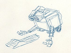
While I'm in disclosure mode I thought I'd take a chance and post these planning sketches that I did for WALL-E. Included are a few that I did for the Superbowl commercial vignette. I hope they don't ask me to take them down again...
Enjoy!
Thursday, January 22, 2009
My WALL-E Reel
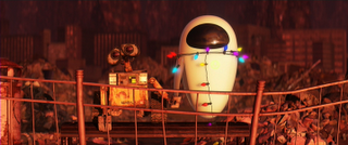
In a week I'll be flying to LA for the Annie Awards, so I thought I'd post my WALL-E reel so you can see what I've been nominated for. It's a whopper: 7 minutes of footage - the most I've ever done on a single film. The Quicktime clocks in at 40 megs, and hopefully it won't blow out my bandwidth! I guess I could have compressed it smaller, but it's hard enough to see all the detail at this size. In a previous post I did a write-up of the shots I worked on, which contains some anecdotal information, if you're interested.
WARNING - Contains Spoilers! Please don't watch this if you haven't already seen the film. And there's really no excuse for you if you haven't.
Enjoy!
Monday, January 19, 2009
Update
Probably not the content you were hoping to see here (I'm working on it, I swear!) but here are some noteables:
Cars Toons are now showing on Disney's web site. If you've had trouble finding them on TV (they don't make it easy) then this is probably the best quality way to see them until they're out on DVD or whatever. I haven't been able to get this page to work in Firefox, but it works fine in Safari and, I assume, Explorer. Your mileage may vary. Did you see what I did there? Mileage... Cars... Ahem.

In other news, the Annie Awards are at the end of this month, but in the meantime I've received another nomination for my work on WALL-E! This time it's a Visual Effects Society nomination for "Outstanding Animated Character in an Animated Motion Picture". The team chosen to represent the character of WALL-E includes Sound Designer Ben Burtt, Modeler Austin Lee, Designer Jay Shuster, and myself for animation. We're up against Bolt, Rhino, and Po. The competition is strong, but I think we've got a pretty good shot at this one. You can see a full list of the nominations here.


Cars Toons are now showing on Disney's web site. If you've had trouble finding them on TV (they don't make it easy) then this is probably the best quality way to see them until they're out on DVD or whatever. I haven't been able to get this page to work in Firefox, but it works fine in Safari and, I assume, Explorer. Your mileage may vary. Did you see what I did there? Mileage... Cars... Ahem.

In other news, the Annie Awards are at the end of this month, but in the meantime I've received another nomination for my work on WALL-E! This time it's a Visual Effects Society nomination for "Outstanding Animated Character in an Animated Motion Picture". The team chosen to represent the character of WALL-E includes Sound Designer Ben Burtt, Modeler Austin Lee, Designer Jay Shuster, and myself for animation. We're up against Bolt, Rhino, and Po. The competition is strong, but I think we've got a pretty good shot at this one. You can see a full list of the nominations here.

Thursday, January 01, 2009
Happy New Year!
Welcome to 2009, everyone! Here's to hoping the new year will be better than the last. I'll be starting teaching again at AnimationMentor.com next week, as well as returning to Pixar where I'll be helping out the Tools department and animating on Toy Story 3; this should be a nice change of pace from directing. I've got some ideas for new tutorials & notes which I hope to be able to post here soon. I'll also be posting a reel of my work on WALL-E, now that the film has finally been released worldwide (Japan was the last holdout). Thanks for reading!

