Tuesday, December 18, 2007

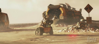
New WALL-E Trailers Online!


Head over to RottenTomatoes and IGN for the new WALL-E trailers. There are two versions, the domestic and international. You can also read Harry Knowles' take on the 15 minutes of footage he screened at the Butt-Numb-A-Thon 9 last week. Enjoy!

Monday, December 17, 2007

Ergonomics


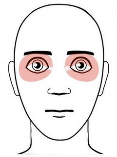
I interrupt this blog to bring you an important public service announcement. I've had a few inquiries lately about the foam tubing that I put on my Wacom stylus (people saw it in my 11-Second Club critique and one of my AnimationMentor.com lectures), and that got me thinking that I should use this blog to spread some more ergo knowledge. It's important to take care of your bodies, kids, if you want to be animating for the long-haul! It's not enough to buy an "ergonomic" mouse; you can have all the fancy equipment in the world but you may still get RSI if you don't have proper posture, alignment and work habits.

I first learned about Repetitive Strain Injuries when I started at Pixar in 2000, and wouldn't you know, I got it working on Monsters, Inc. Before that I had worked for 5 years on computers and never had a problem. Self-fulfilling prophecy, Pixar curse, or just a matter of time? Either way, after some physical therapy, accupuncture, ergonomics lessons and regular stretching I'm back to working pain-free. If I push myself too hard the pain returns, so part of the solution is to learn how much your body can take.

There are many kinds of RSI, the most publicized being carpal tunnel syndrome. Mine manifested more in the muscles in my shoulder and neck rather than the nerves in my wrists, but it's no less serious. I found that for me yoga and swimming are really effective in relieving the soreness and stiffness. I was lucky in that I work for a company that is very proactive about preventing and treating RSI, and we have people on staff to help us set up and use our workstations. You may not be so lucky, so please try to educate yourself. Below are some links to articles written by my friend and former Pixar Ergonomist, Shelby Cass. I hope you'll give them a read and evaluate your own work habits. Stay healthy out there!

Are You Ergonomically Correct?
What is Ergonomics?
Shelby's Web Site

Monday, December 10, 2007

Freaky Francomation!

The students at Supinfocom in Arles, France always put out good work, and this latest one, "Musicotherapie" is no exception. Really original style and, uh, story. I don't know where they come up with this stuff...
Friday, December 07, 2007

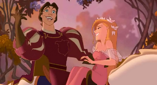
James Baxter's work on "Enchanted"


Beautiful stuff. What else can I say? Kind of embarrassing to have my own drawings so near these gorgeous ones in my blog. I should have put some blank posts in between to separate them more!

Wednesday, November 21, 2007

More on planning


There have been a few questions about my thumbnail post below in the comments and by email, so I thought I'd elaborate some more here.

Hans Brekke asked:
On a few of the pages you mention that you used other movies for inspiration, like the shining. I thought that was very interesting and its an approach I haven't tried before. How do you make a scene, that is from another movie, relate to your scene, and what do you look for in those scenes? It would be very helpful to hear how you plan your scenes by using material from other movies.
This is a good question. Let me start by saying that I'm not looking to steal someone else's performance for my scenes. Rather, I'm looking for ideas that I wouldn't have thought of on my own. I can only go so far on my imagination; pretty soon my characters will all start to move and behave like me! Therefore I find it important to look outside myself for inspiration and reference, be it in other films or in real life. When doing research for a character I try to find live actors who resemble the character somehow, in personality and/or physiology. In the case of Syndrome, Brad Bird had suggested several actors, including Jack Nicholson. Nicholson's performance in The Shining is over-the-top, perhaps even cartoony, so I thought I might find some interesting ideas in there. I was looking for poses, facial expressions, gestures, bits of timing, anything I could find to make Syndrome more creepy and threatening (and a jerk). For the scene where Syndrome says "I'll give them heroics; I'll give them the most spectacular heroics anyone's ever seen!" I drew inspiration and reference from The Shining, Paul Gleason in The Breakfast Club, Ratigan in The Great Mouse Detective, and of course, my own imagination.

Jonathan asked:
Maybe this is too in depth, but how do you decide how far to take a thumbnail? I mean, many times I have very loose thumbnails, and i wonder if it is better making them more refined. Like, even the stick figures have all of the motion etc defined and of the correct proportions for the character.
The purpose of a thumbnail is just to communicate the important facts about a pose. For instance, the angle of the hips and shoulders, the curve of the spine, the placement of the feet, etc. Some rudimentary facial expressions may also be in order, depending on the shot. As long as you can clearly communicate these things to yourself (and anyone you may need to show them to) that is far enough. I think it's also important to convey the basic proportions of the character you're animating, otherwise you may draw poses that the model can't really achieve. That said, as someone who likes to draw I often find myself embellishing my thumbs with more detail than they need, just because I enjoy the process!

Jorge "Jay" Garcia asked:
Once you get your boards, how close must you follow them when planning and thumbnailing?
It depends on the story boards. Sometimes they're very specific and indicate exactly what the director wants, so I try to match them as best I can. Other times the boards are loose and just suggest the main beats of the shot, so I try to make it my own. The director and I will discuss the scene before I begin planning, and he'll let me know what he expects and how closely I need to follow the boards.
Saturday, November 17, 2007

Animation Thumbnail Gallery Added


I periodically get requests from students and others to see some of my planning drawings, so I've put together a little gallery of some of my favorites from past projects. They're not meant to stand alone as good drawings, but you might find them interesting as an example of the thinking that goes into my work at Pixar and AnimationMentor.com. I've included a bunch from my one Ratatouille shot, which I linked in a previous post.

Friday, November 16, 2007

More on the Great Debate

There's a good article on the AP website that further explores the debate about motion-capture as animation. You can read the full article here. Below are some quotes that I found interesting.
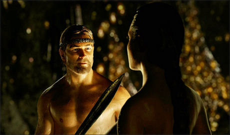
The creators of "Beowulf" don't call it animation, nor do they intend to replicate real life.

"It's a new art form that is performance-based," producer Steve Starkey said, echoing comments Zemeckis made about his 2004 effort, "The Polar Express" (a performance-capture movie that had many traditional animators shuddering for its characters' lifeless eyes and stilted movements.)

"If one were to call it traditional animation, I think it would be a disservice to the brilliant animators of the like that worked on 'Roger Rabbit,' that brought those characters to life. I also think it would be a disservice to the performers like Ray Winstone, whose performance lives on-screen."
Tuesday, November 13, 2007

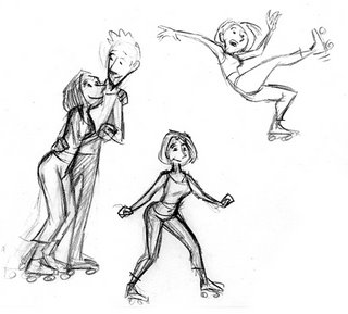
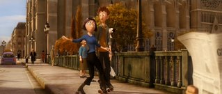
My One Shot on Ratatouille


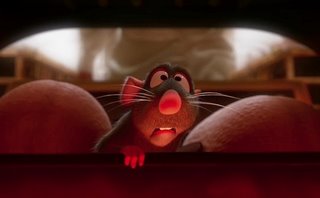
I only animated one shot on Ratatouille. I was working on Cars promotional material and WALL-E during most of Rat's production, but I begged them to give me a shot on the film because I knew it was so special (and I wanted to work with Brad Bird again). I figured they'd give me a simple acting shot or some little gag, but instead they gave me a full-body shot of humans on rollerskates! It was pretty challenging, and I did most of the work on my own time. I did a lot of research and worked out some ideas with my wife (who used to skate competitively), but I ended up throwing most of that out and going from my imagination, because the shot was so short and needed to be broad. The only direction I had was that Colette is a bad skater, Linguini is a good skater, and they need to exit frame right. How this happened was pretty much up to me. I'm happy with how Colette's spin and fall worked out, but I think the weight of Linguini lifting her still needs work. Ah well, animation is never finished, only abandoned.

Monday, November 12, 2007

"The Pixar Story" screening in SF again


"The Pixar Story" will be screening in SF, this week:

NOVEMBER 13-15, 2007

San Francisco
Lumiere 35
1572 California Street
San Francisco CA 94109
415-885-3201

Daily Screening Times:
November 13, 12pm & 7pm
November 14, 12pm & 2pm
November 15, 12pm & 2pm

Saturday, November 10, 2007

Sample eCritique at the 11 Second Club


I'm sure you're familiar with the 11 Second Club - a monthly animation competition that follows in the footsteps of the late 10 Second Club. The prize for this month's competition, sponsored by AnimationMentor.com, was a critique by a professional animator, in this case, me! Here you can get an idea of what an "eCritique" looks like for students who enroll in AM's animation courses. Every week the mentors review the students' assignments in this fashion. It's a pretty neat setup, allowing the mentors to analyze students' work frame by frame and even draw on it. Students and mentors can be anywhere in the world (that has an internet connection), and there is also a weekly Q&A conducted live via webcam. Hope you enjoy the eCritique!

Thursday, November 08, 2007

The Rat vs. the Dragon Slayer


The film "Beowulf" has been approved for submission for the Best Animated Feature Oscar by the Academy. You can read more about it here. I haven't seen Beowulf, and I usually keep my negative thoughts off of this blog, but I find this a disturbing development.

To my mind, submitting a motion-captured performance as "animation" is akin to submitting a heavily retouched photo as a "painting". Let me back up a bit and say that I'm not wholly opposed to motion capture (or "performance capture", as Mr. Zemekis would have me call it), just as I'm not opposed to Photoshop and digital collages; these technologies have their places. The fact that I have yet to see a compelling or life-like performance created with motion-capture is beside the point. The question becomes, "what is animation?" I'm sure that many animators worked on Beowulf to clean up the capture data, massage performances and animate non-human characters elements. But does this extra work beyond the raw capture data make it animation? Where do we draw the line between recorded action and creative animation? Between the retouched photo and the painting. The more I ask myself this, the more I realize that these are the wrong questions to ask, because the answer require a level of semantics that distracts from the more important question: "Which is the best film?"

As visual effects and digital cinema become more advanced the term "Animated Feature" loses its significance, at least when judging the merits of a story, because the line between performance and visual effects is becoming blurred. I believe the category of Best Animated Feature should not exist, because it creates an arbitrary distinction between mediums and ultimately ghettoizes animation into a separate category so that it can never compete for Best Picture. If you want to make distinctions, do it by genre, not by medium. Ratatouille is the best reviewed film of the year, but it will never compete directly against the year's live-action films because the Academy has it squarely seated at the kids' table.

Tuesday, November 06, 2007

But wait, there's MORE!

Going to be in the San Francisco area this Thursday, November 8th? Check out the new documentary, "The Pixar Story" at the 2nd SF International Animation Festival. It's a great film and an intriguing look at the genesis of Pixar. Yours Truly is the first face you see in the doc! Woohoo!

Director Leslie Iwerks will introduce the film and participate in a Q&A.

Screening Times:
6:45PM and 9:30PM

Location:
Landmarks Embarcadero Theater
One Embarcadero Center, Promenade Level
San Francisco, CA 94111
(415) 267-4893

More details and ticket info: www.sffs.org/events/index_series_sfiaf07.html

Ratatouille on DVD and Blu-Ray today!


Go get yours! Includes the short film "Lifted" and an new short, "Your Friend The Rat", which includes 2D and even some stop-mo animation!


Also available today, "Pixar Short Films Collection, vol. 1" on DVD and Blu-Ray. Start your Christmas shopping now!

Friday, October 12, 2007

2007 Animation Mentor Showcase

Check out the latest highlights of the work being done by students at AnimationMentor.com. I'm teaching there again this semester and I'm always amazed at the talent they attract.
Friday, September 28, 2007

WALL-E International Teaser Debut


"Yahoo will launch the international teaser/logo gag across their network on Monday 10/1. The trailer will be featured in the homepage 'Entertainment' tab where the video will play in-screen. Yahoo is the only portal that offers this video capability, maximizing views on the site’s most trafficked entry point. In addition to homepage placement, the teaser will be the debut video on Yahoo’s new 'Premieres' page that launches on Monday."

yahoo.com

Friday, September 14, 2007

3 Speeds


Something I heard back when I was first learning animation that still really helps me to this day: always try to get three speeds in your shot. Put in slow moves, medium moves, and fast moves. This will help give your shot texture, interest, and emphasis. If you can have different parts of the body moving at different speeds, even better! Take a look at this clip from 101 Dalmatians. This animation is beautiful in many ways, all of which I wont go into here, but pay particular attention to the timing of the actions. Pongo is sleepy, so naturally there are lots of slow movements. But there are also faster moves for emphasis, such as the ear scratch, the collapse at the end where he lets gravity take over, or the high frequency shaking during the stretch. Not only are there three different speeds of animation, but some of these speeds are happening simultaneously. Another example would be to have a character shaking his head as he raises his arms up slowly in anticipation of a gesture. The more variation you can add to your timing, the better. I see a lot of student work where the characters are always moving in a "snappy" fashion. This is fun to watch for a while, but soon the timing becomes boring because there is no contrast. So don't forget to shift gears!

Thursday, August 30, 2007

Interviews with Hayao Miyazaki

Here are some interviews from 1999, coinciding with the release of Princess Mononoke. Miyazaki-san has some interesting perspectives on animation, children, and the world.

Part 1:

Part2:

Saturday, August 04, 2007

The 11 Second Club

Remember the 10 Second Club? It was a great site where animators competed every month by animating to the same 10 second audio clip. Unfortunately this site is no more, but it's spirit has been resurrected in the form of the 11 Second Club. This site is generously maintained by 3 people, including two former AnimationMentor students. Swing by and cast your vote on the latest entries! Better yet, why not compete?

Thursday, August 02, 2007

Exaggeration


Exaggeration is a very important principle in animation - after all, we're trying to caricature and distill life to it's clearest essence, not reproduce it verbatim. But many students often misunderstand the meaning of exaggeration; they think it always means "bigger" or "faster" or "broader". Not so! It can also mean "smaller", "slower" or "subtler". The key is the "-er": figure out the adjectives that describe the attitudes and actions in your shot, then try to make them "more" like that by adding "er" to the end of the adjectives.

If every pose and action in a performance is extreme then none of them are - the texture becomes even and the audience gets bored. It's important to have big moves AND small moves, fast ones AND slow ones. By varying these elements you give variety to your scene and place emphasis where it needs to be. If you've got three big changes and one small change, the small one will stand out.

The late Chuck Jones was a master of exaggeration. He could achieve more impact with a single eyebrow raise than a lot of animators could with a full-body take. Just look at his work on How The Grinch Stole Christmas and his later Warner Brothers shorts. He knew that less could be much more. He could exaggerate the stillness of a character's pose, so that a change would be isolated to a single small part of the character; perhaps a single muscle. He made a trademark of having a character hold a pose and just glance at the camera with his eyes, as if to say, "what the...?"


So the next time your planning and animating a character, think of ways to make it "er"!

Tuesday, July 31, 2007

Comic-Con 2007


Last week 30,000 people attended the 2007 San Diego Comic Convention. I was there in my home town on Friday and a little bit on Saturday, and it was pretty overwhelming. I've been going since 1993, and it has at least tripled in size since then. I barely had an opportunity to visit all my favorite vendors, and I only made it to one panel: the WALL-E panel, of course!

There, 7,000 lucky guests were treated to glimpses of preproduction art, animation tests and a synopsis of the film by director Andrew Stanton. They also got to see a sound demo by Star Wars veteran Ben Burtt, and about 7 minutes of footage from the film! Here are some reviews of the event:
Audio Interview with Andrew:
http://www.comingsoon.net/audio/stantonwalle.mp3
"I think that dog is happy to see me" / "I don't care what the math says, it's not doing what it's supposed to" / "I've been watching a lot of BSG"

http://www.comingsoon.net/news/movienews.php?id=22911
"It certainly looks like another imaginative, fun film from Disney and Pixar. It also looks like Ben Burtt's going to win another Academy Award for sound design."

http://www.slashfilm.com/2007/07/28/comic-con-indepth-wall-e-details-revealed/
"The footage that was shown was unlike anything that has been ever done by Disney before. I’d call it an anti-Disney movie."

http://www.cinematical.com/2007/07/29/comic-con-prince-caspian-and-wall-e-the-disney-pixar-pre/
"If you're reading a story about Comic-Con on a film site I probably don't need to tell you how much Ben Burtt rocks and how much of a contribution he makes to any film he works on."
"In short, the clip was great and I can't wait for the film."

http://weblogs.variety.com/thompsononhollywood/2007/07/comic-con-toon-.html
"Going in to Comic-Con, we published a list of the 10 most anticipated movies being presented in San Diego. Coming out of the convention, the two films I can't wait to see in their entirety were nowhere to be found on our original list (that's the beauty of Comic-Con, really).
First, there's Pixar's next toon, "Wall-E," from "Finding Nemo" director Andrew Stanton."

http://forums.somethingawful.com/showthread.php?threadid=2574379
Same thing here: http://www.aintitcool.com/node/33497
"we got an awesome 10 minute clip from the beginning of the movie. Andrew Stanton stressed that it was unfinished. Still, it looks loving amazing"

http://www.reelzchannel.com/outtakes/blog.aspx?blogentryid=409
"Where as Fox's Robots took the standard approach to robot animated characters we've seen a million times before, Pixar's creativity shines through in a very original way."

And here are my photos from the 'Con.

Saturday, July 07, 2007

Visualizing Taste


Michel Gagné has posted an article on his web site about how he created the 2D visuals for the tasting sequences in Ratatouille. It's not often that you get to see this sort of abstract animation in a feature film, and trying to visualize flavor must have been especially challenging.

Tuesday, July 03, 2007

"Lifted" on iTunes Store


The lastest Pixar short film, "Lifted" is now available for purchase on the iTunes Store. Hopefully you've already seen it in front of Ratatouille...

Tuesday, June 26, 2007

Walking...

Is it animation or performance art? Or is it just weird? From poster "notblu":
2 loops from walking animated wall painting.
the video is stretched horizontally. It was filmed with a camera in vertical position but youtube doesn't accept that format.
Wednesday, June 20, 2007

The Latest Short Films From Gobelins


The French animation school Gobelins, has just posted their latest student clips created for the Annecy festival. These guys consistently produce great work, and really push the medium. My favorites are La Grande Arche and Chronos 1.0. Enjoy!

Sisyphus

Here's a nice piece of hand-drawn animation from 1974. Great use of line and a sense of weight, and also note the amount of variation in what would otherwise be a repetitive action. My advice for enjoying this clip: turn off the sound!

Monday, June 18, 2007

For the record...

There are some early reviews of Ratatouille on Ain'tItCoolNews right now, including one where a viewer compares the Pixar short film "Lifted" unfavorably to my own "Alien Song". To quote:
Another thing that bugged me was the Lifted short, the main alien reminded me to much of the “I Will Survive” animation that was everywhere online about five years ago where the alien was singing “I Will Survive” and then at the end a disco ball falls on it and flattens it. There were some funny parts in the short, but not great.
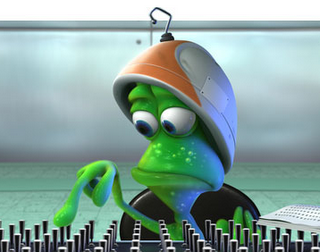
First of all, don't believe this guy. Lifted is hilarious! But beyond that I don't see much similarity between it and my film, other than that there are green aliens involved, and some violence. I don't even think director Gary Rydstrom had seen my film before he started to develop Lifted. The alien designs are a lot more interesting than mine, and they have TWO eyes! Take that! This reminds me of some similar conjecture years back when people were saying that Mike Wizowski of "Monsters, Inc." was a rip-off of my alien as well. Well, maybe there's a hair of truth to that...
Sunday, June 17, 2007

Football Vs. Rabbit


This is a really cool example of using CG to emulate claymation. Nice squishy-stretchy feel!

Friday, June 15, 2007

WALL-E Teaser...


Tune in to Entertainment Tonight at 7:30pm PDT for a first look at the teaser trailer for Pixar's 2008 feature, "WALL-E". It's on KRON Channel 4 in the Bay Area. Check your local listings. You'll get a little taste of what I've been working on for the past year or so. Sorry for the late notice, I just found out about this myself!

UPDATE: the teaser in now online, in HD, even! Thanks to Alexiss for the tip.

Monday, June 11, 2007

Some thoughts on "Ratatouille"


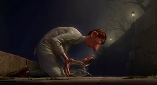
A couple weekends ago (June 2) I had the pleasure of seeing Ratatouille with my fellow Pixarians at its wrap party. Now, we had all had a few drinks, and the crew was pretty exhausted, so we weren't the most objective audience, but I think it turned out fantastic. I'll admit, the premise of a rat who wants to be a chef never excited me that much, but when the story is in the hands of Brad Bird, you know you're in for something special. The story was funny and entertaining, the characters memorable, and the production values are off the charts. This is by far the best looking film Pixar has ever done, and probably the best looking animated film to date. The lighting is sumptuous, and the detail in the sets and characters is downright compulsive. Then there's the animation... There is acting in this film the likes of which has never been seen before in animation (at least not since the Golden Age of Disney), and the performances are more consistent throughout the film than ever before. This is partly because the Pixar animatosrs are at the top of their game, and partly because Brad Bird has written scenes that demand great animation. This film has definitely raised the bar on all levels, from story to cinematography to animation to shading to effects. It's such a dense and layered film, too, so I look forward to seeing it again (with a REAL audience) to pick up more of the details.

I only contributed one shot to this film, so I have the more distance from it than previous films, which makes it even more special to me. I don't know if this film will make a lot of money. How do you market cooking to kids and dads, and rats to moms? I just know that if people get to the theater, they will enjoy it. I expect this movie will be very well-reviewed, and hopefully that buzz will translate into some good revenues. Not that Pixar is in danger of extinction, or that if we don't break opening day records there will be layoffs or famine in the crew. But a movie with so much love and craftsmanship doesn't come along very often, and it deserves to be enjoyed by the masses. These movies we make are gifts to the world, so help us share the gift.

If you're reading this blog then you're probably already an animation fan and were likely going to see this movie anyway. But if you like it, see if you can't drag along someone else to see it who maybe isn't a fan. Tell your mom or the guy in the Starbuck's line. I bet they'll thank you later. And so will I.

Tuesday, May 29, 2007

Cool overlap tutorial

Courtesy of the blog "Flip". This a simple, structured way to think about drag and overlap in your animation, and it fits nicely with the spline workflows that I outline in my tutorials.

Friday, May 11, 2007

Cool Cake Animation


Some great squashy-stretchy claymation in here, set to the music of "La Traviata". Probably doesn't taste as good as it looks!

Thursday, May 10, 2007

Computer Animation and Drawing

There's a cool article over on the Spline Doctor's blog about the importance of drawing for ALL animators, not just 2D animators. I get asked about this a lot, and I think Dr. Stephen Gregory does a good job of laying it down. Here's the article.

Wednesday, May 02, 2007

9 Minutes of Animation Bliss


I know I've been using this site to shill for Pixar movies a lot, and they don't really need the help. But I'm really excited about Ratatouille, and particularly about the 9 minutes of animation they just released! If you're like me then you prefer to wait and see it on the big screen and be surprised. But if you're not excited about Pixar's next feature, I suspect you will be after viewing this. Everything about this movie, from the story to the animation to the effects, camera, lighting, etc., raises the bar for the medium. I only animated one shot on this film, but I'm proud to have been a part of it. Enjoy!

Tuesday, April 24, 2007

The Return of Goofy


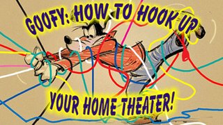
Looks like Disney Animation will start making 2D shorts again in the classic style! The first out will be "How to Hook Up Your Home Theater" starring Goofy. There are some heavy-hitter animators on board for this one, including Eric Goldberg, Andreas Deja and Mark Henn. I had the privelege of seeing the story reels at Pixar and I can tell you that it's hilarious! I'm looking forward to a return to form for Disney Animation! Read more about the short on AnimatedViews.com.

Saturday, April 21, 2007

Yeah, it's been a while

Things have been crazy at the old Navone homestead. We had another baby and lots of visiting in-laws. Work was crazy, and I'm still teaching. So that's why I haven't posted anything in about a MONTH. Sorry for lagging!

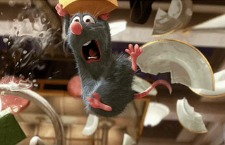
In the meantime, here's an interesting resource for facial expressions: ARTNATOMY. It's a bit academic, but I think it's valuable for artists and animators to familiarize themselves with facial anatomy, and this site presents the information in an interesting and interactive way.
Thursday, March 22, 2007

New Ratatouille Trailer on Friday

Officialese:

*TUNE-IN*
SITE: DISNEY.COM
DATES: Monday, March 19-Friday, March 23 @ 9:04PM
URL: http://www.disney.com
http://home.disney.go.com/movies/
SUBJECT: RATATOUILLE
NOTES: Trailer Tease

An exclusive trailer tease was created for Disney.com to notify users that the exclusive brand new trailer for RATATOUILLE will be available on Friday, March 23rd at 9:05PM PDT – ONLY on Disney.com. This video will be featured all week on the Disney.com Homepage, Movies page and segment pages.


*TUNE-IN*
SITE: DISNEY.COM
DATES: Friday, March 23 @ 9:05PM-Sunday, March 25 @ 11:59PM
URL: http://www.disney.com
http://home.disney.go.com/movies/
SUBJECT: RATATOUILLE
NOTES: Online Trailer Debut

Disney.com has the exclusive online debut of the new theatrical trailer for RATATOUILLE. It’s the first video in the play list on the homepage – making it so that every guest who visits Disney.com automatically sees the new trailer! The trailer will be exclusive to Disney.com for 48 hours. Following the exclusive period, the trailer will still receive homepage promotion on Disney.com, as well as the movies page and segment pages.

Also, www.ratatouille.com will be refreshed on Monday to include the trailer in multiple sizes, including HD, and hard tapes and streaming links will be delivered to all outlets on Monday morning.

Sunday, March 18, 2007

Splinophilia Part 2 is up

It's done at last. Hope you like it. I'm gonna sleep now.

Thursday, February 22, 2007

New Tutorial Up: Splinophilia


I finally got this tutorial worked out. It swelled to about 3 times as big as I expected (which is typical for me) and this is only part 1. Hopefully there's stuff in there for newbies and veterans alike. Comments are welcome if you think something is unclear, or you think I'm full of it.
Enjoy!

Tuesday, February 20, 2007

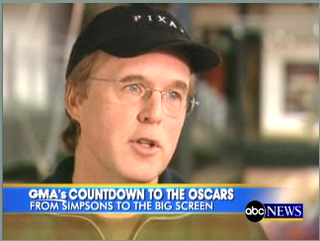
Brad Bird on Good Morning America


A few months ago a camera crew from Good Morning America showed up at Pixar to interview Brad and film some of the production on Ratatouille. This clip contains some never-before released footage from the film, as well as a peek inside of Pixar. Here's a supporting article on ABC's site.
By the way, I'm almost ready to post the next tutorial on splines that I mentioned way-back-when. I've just got a few Quicktime embedding issues to sort out.

Thursday, February 08, 2007

Ratatouille Test Animation Online


Check it out! This was animated by Doug Dooley last year and is not actually a scene from the film.

Wednesday, February 07, 2007

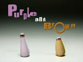
Purple and Brown


Those guys at Aardman just have too much fun. Witness their new series of shorts, "Purple and Brown". Two simple characters with simple minds = pure viewing satisfaction. Enjoy a slew of clips on YouTube. There's also a downloadable clip here. And here's a blurb:

Aardman Animations is continuing its full-scale deployment of television content with a new interstitial series titled Purple and Brown for Nickelodeon U.K. Created by Aardman's Richard Webber, the ten one-minute shorts are set to launch on the kids' channel on Feb. 13 and are now available for download on Nickelodeon U.K.'s broadband video service, TurboNick.

Purple and Brown are two comical stop-motion characters who live in a world populated by other equally weird and wonderful plasticine characters. In each episode, they greet their new friends with infectious laughter and an innocent curiosity, which always ends in one or both of them sustaining a considerable degree of injury.

The series is exec produced by Nickelodeon's Howard Litton, along with with Aardman's Miles Bullough, David Sproxton and Peter Lord. Webber, whose animation credits include Creature Comforts, Angry Kid and Morph, writes, directs and provides voices for the interstitials.

Aardman recently sold its clay-animated Creature Comforts television series to U.S. broadcaster CBS, which will air an Americanized version as a 2006-2007 midseason entry.
Wednesday, January 24, 2007

Oscar Showcase at AWN.com


AnimationWorldNetwork.com has posted summaries and clips from all the Oscar-nominated features and shorts for 2007. You can see a clip from Pixar's "Lifted", directed by Gary Rydstrom, here.

Thursday, January 18, 2007

The Animation of Romain Segaud

One of my favorite French animators, Romain Segaud, has a new (to me) web site featuring a variety of his personal and commercial work. My favorites are the short film "TimTom" and the music video "Bip Bip". Allez voir!

Tuesday, January 16, 2007

New interview with me on Planit3D.com

At least somebody's web site is getting some new content from me. I did this interview last year but only found the link just now. Thanks to Daryn Fitz for caring!

Saturday, January 13, 2007

Congratulations to AnimationMentor.com Graduates!


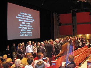
In an emotional and historical ceremony, the first two classes of AnimationMentor.com students celebrated their graduation from the 18-month program today. I was able to attend, along with some other fellow mentors, and it was great to finally get to meet a lot of my students face-to-face. The event took place in San Francisco at the Fort Mason Center near Fisherman's Wharf and I was surprised to see that so many students had traveled from all over the country (and even the world) to attend. Congratulations to all the graduates, and best of luck in your careers! You can see a highlight reel of their outstanding work here.

Sunday, January 07, 2007

Saturday, January 06, 2007

The art of Mathias Verhasselt


This guy's conceptual designs and color renderings are awesome. Reminds me of how much I need to work on my own stuff. I wish I understood color as much as he does. Sigh. Anyway, all his images are on one page so it takes a while to load (it's worth it). Someone needs to introduce him to thumbnail galleries!

This blog has been a little light on content lately, thanks to holidays, illnesses, life etc. I'm working on another tutorial now and I hope to have it finished up some time this month. Keep checking back!

Al Hirschfeld in action


Thanks to Noah for this one. Here's a small glimpse into the process of a master draftsman and designer. I hope my hand is that steady when I'm 99!